Android 12's Privacy Dashboard does the one thing it had to do — be a single place where you can see exactly which apps are accessing your potentially sensitive data.
The second beta of Android 12 has arrived and among the additions is one I've been looking forward to for a while — the Privacy Dashboard.
I'll tell you right up front that this isn't the end-all-be-all when it comes to managing your digital privacy, but that unicorn doesn't exist anywhere, even on the best Android phone money can buy. But it's actually better than I expected it to be, and since this is "just" a beta release, there is time for it to get even better. I've been taking a look at it for a minute, and here's everything you need to know about how it works and what I think of it.
What the Privacy Dashboard is
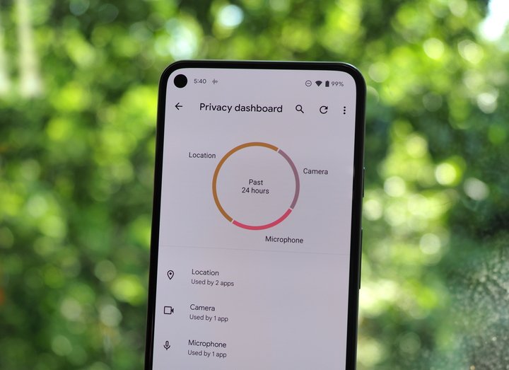
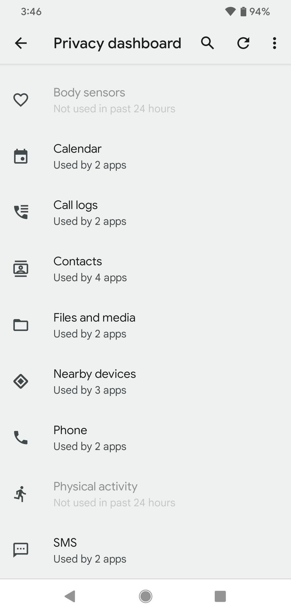
Imagine a single screen with a list of all the permissions and hardware that could be used to transmit sensitive data. Things like your location or your phone call logs. Things like your camera and microphone, too. These are items that many apps have a legitimate need to use but also often get abused by apps that have no business accessing them. Does a flashlight app really need access to your address book? (Editor's note: No, it doesn't)
The Privacy Dashboard makes it easy to see an app that's not behaving the way you expect.
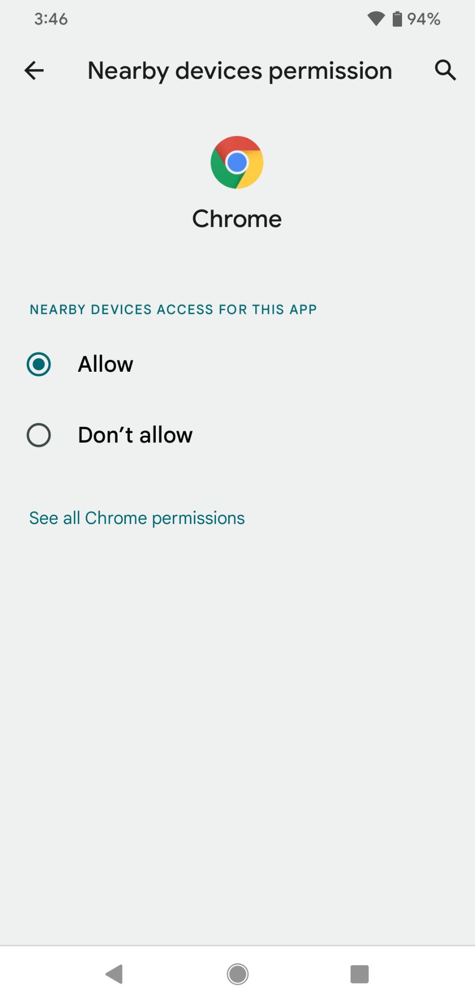
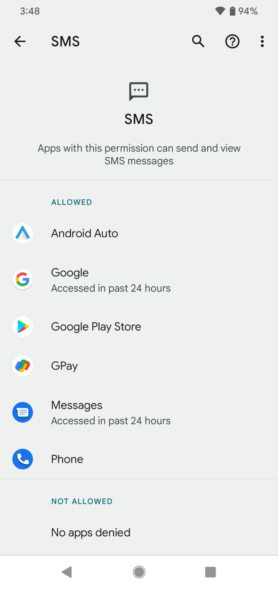
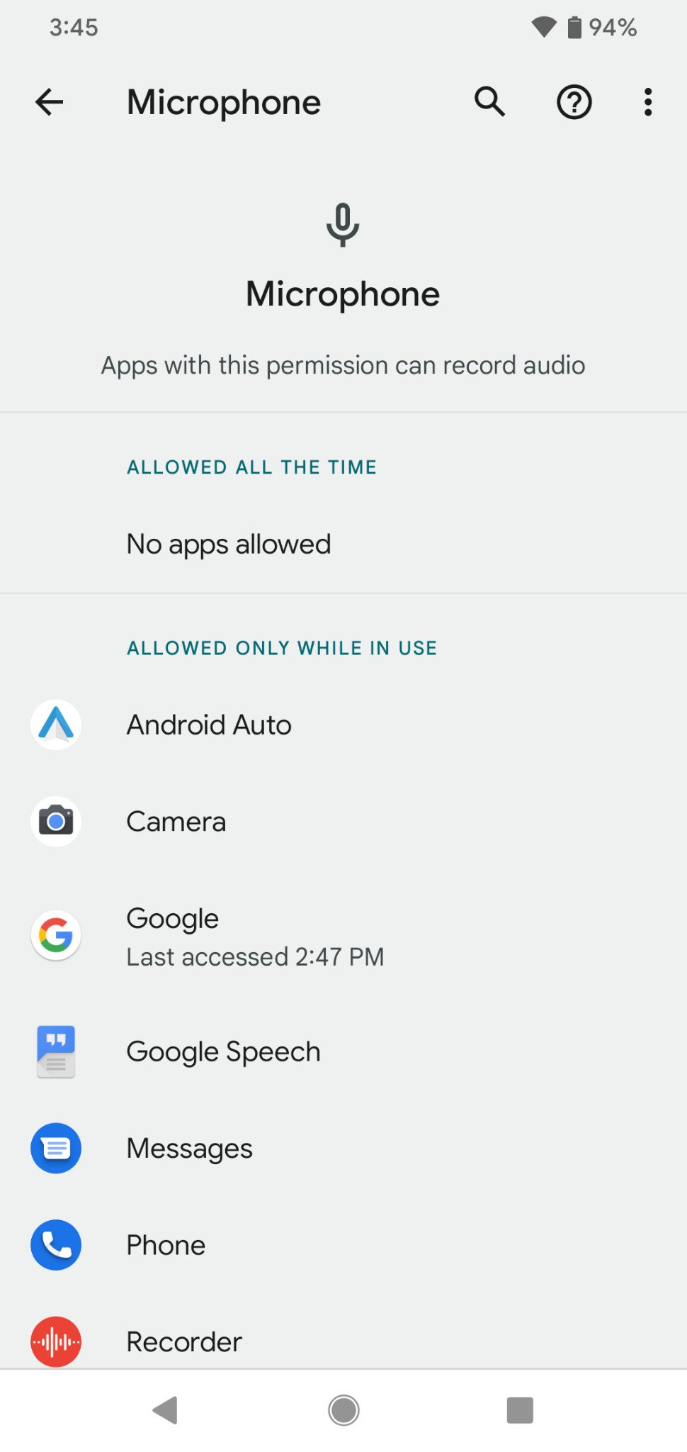
That's what the Privacy Dashboard is. It's a simple list of both software and hardware permissions that the architects of Android feel are important, and you can tap on any of them to see what apps accessed them and when. The list is pretty comprehensive, even things like body sensors (the sensors inside your phone that are used to detect movement) are included.
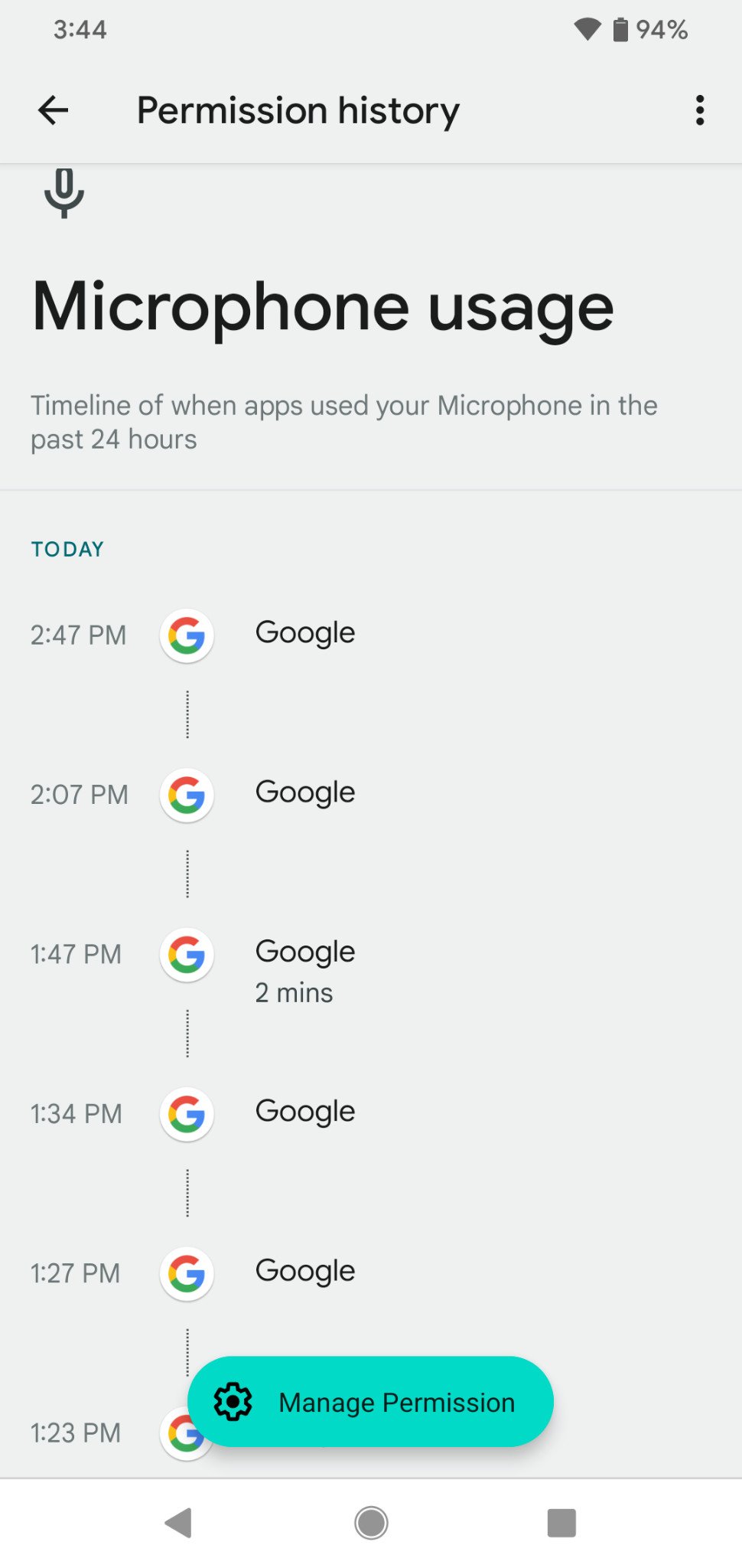
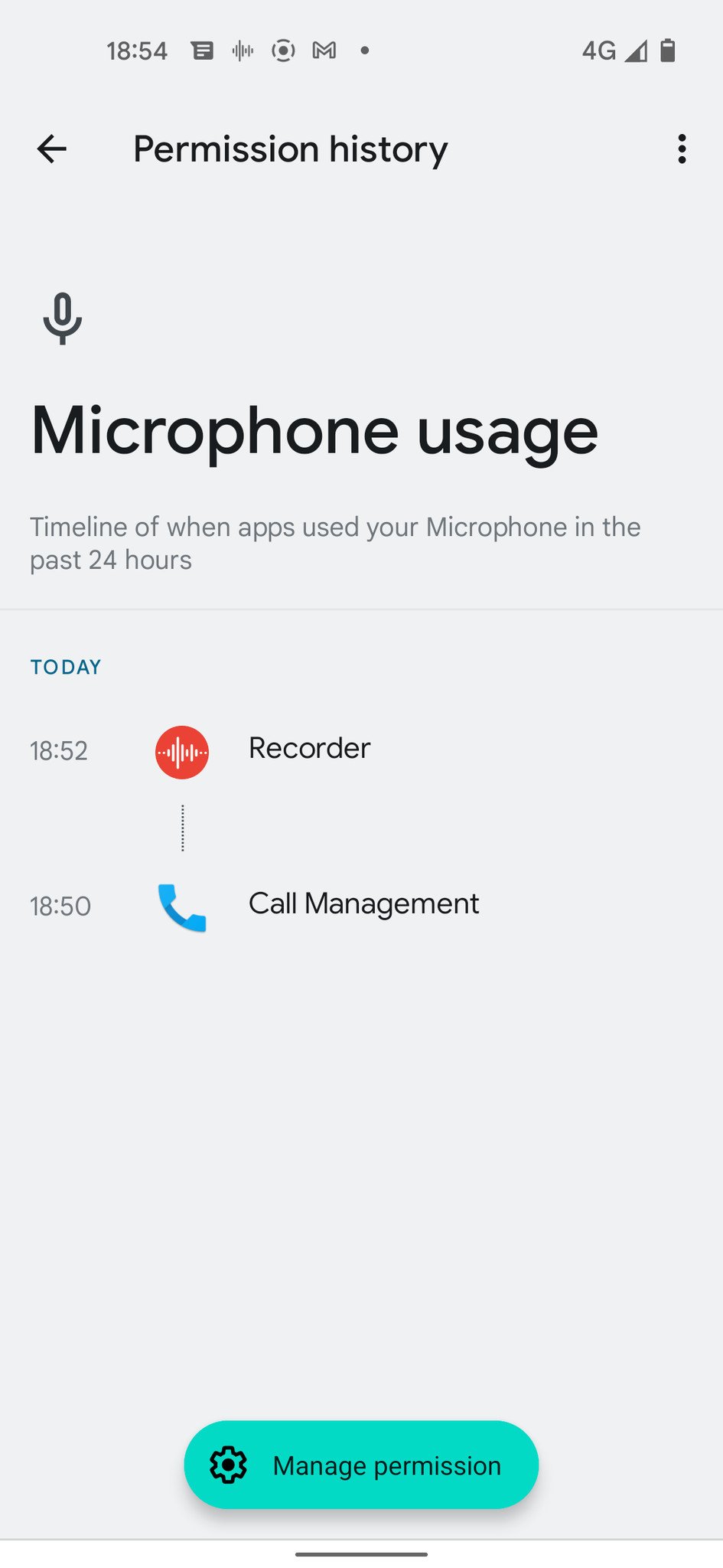
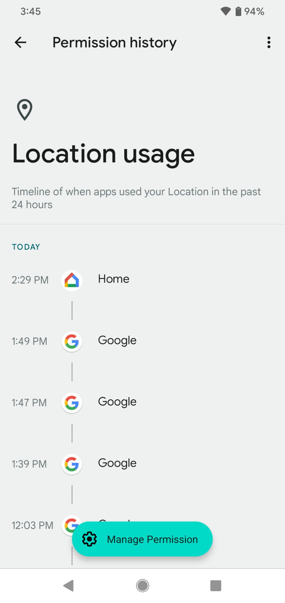
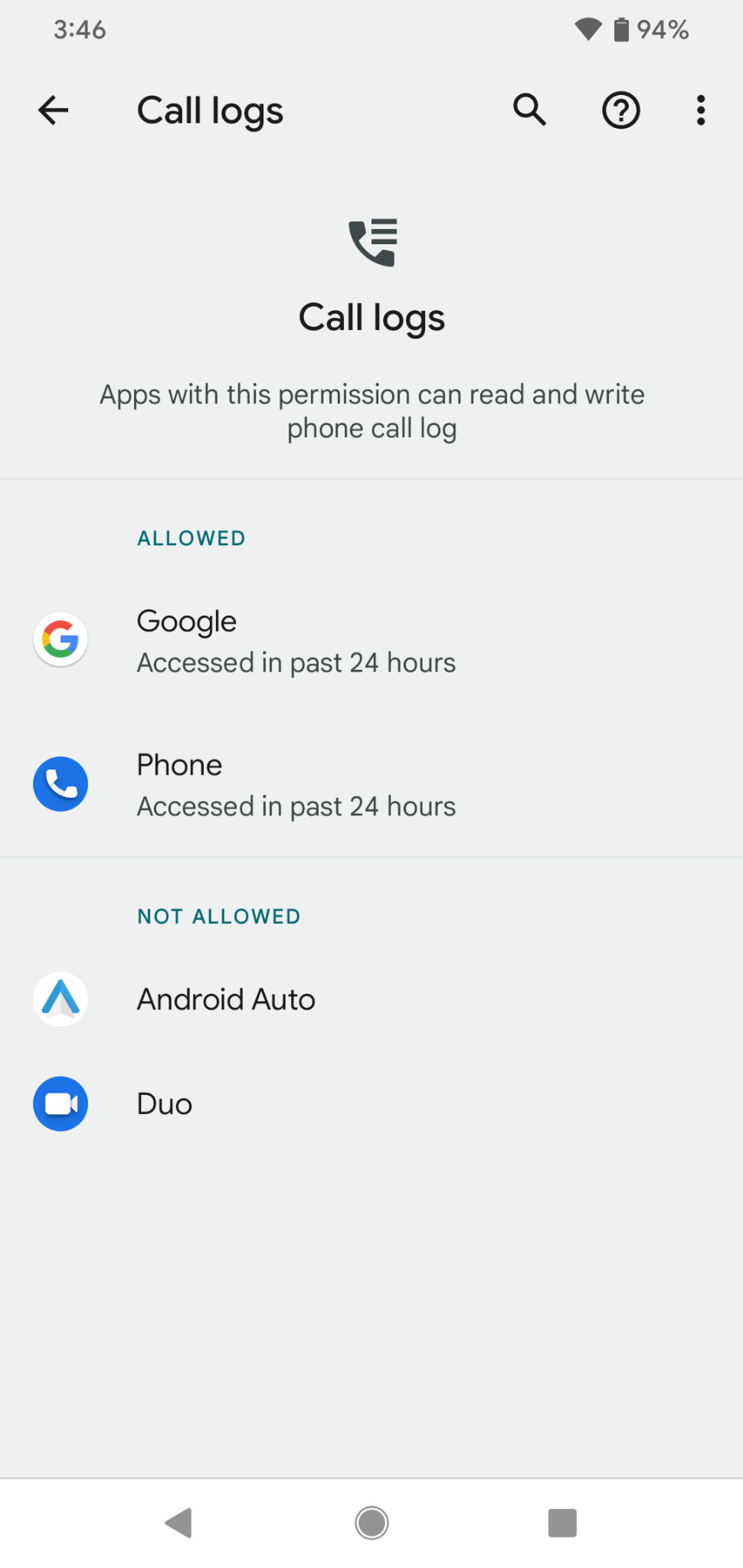
As mentioned, tapping on any of the list items will open a new window showing which app or service — yes, Google's own services are included in the Privacy Dashboard — accessed the item in question and exactly when. For example, if I say "Hey Google" at 2:55pm, it will be logged as having used the microphone as 2:55pm. A phone call does the same.
This is useful. In fact, it's far more useful than just the prompt telling you that an app wants to use the microphone (as in my example). That's because I know I said "Hey Google" at 2:55pm and expect to see it logged as having used the mic, and I know I called my mom on Saturday at noon, so seeing it is expected. This gives you an opportunity to see what you didn't expect to see.
That's what's great about the Privacy Dashboard. It's a powerful tool and one of the best additions to Android in a long time. Combined with other new additions like microphone and camera use indicators as well as a system setting to shut both off, Android 12 is by far the most privacy respectful version ever. Granted, there are still many troubling issues surrounding privacy that Google needs to address, and they assure us they are doing so. This is proof that the company is listening and can do something to help us feel more secure about our private data.
Where it needs some work
Like anything, the Privacy Dashboard isn't perfect. Some of my niggles are minor — it looks very plain and even the circular graph does very little to catch any attention. The rest of Android 12 is getting a bit of an extreme makeover and this tool is still plain Jane in every way. While a privacy-focused utility doesn't really need to be flashy to be effective, flashy things draw more eyeballs. This is a thing that needs all the eyeballs to see it and use it.
It's too important to be buried deep in the settings.
It's also buried a bit deeper in the settings than I would like. Remember the BlackBerry Key2? I won't judge you if you don't, but BlackBerry's version of Android had a similar utility called DTEK. DTEK had two things going for it — it was pretty to look at and it had an icon right in the app drawer so you didn't need to dig around to find it. It wasn't very useful, but it did look good and was easy to find. Here's where you'll find the new Privacy Dashboard:
- Settings > privacy > Privacy Dashboard
There is still time to pull it out of a three-level deep menu and bring it front and center, which is something I hope Google does.
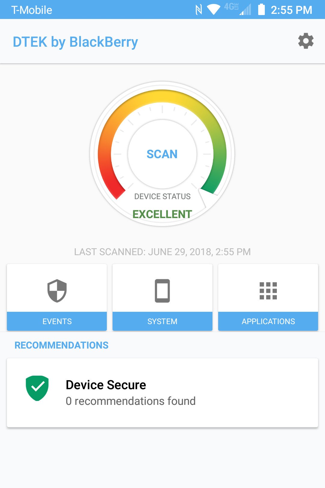 Pretty, but not very functional.
The biggest problem about the Privacy Dashboard though is that you need to be a bit of an Android nerd to decipher some of what you're seeing. Sure, you can see that a certain app accessed your location last night and then click through to revoke the location permission. That's simple and straightforward. But nothing tells you why it accessed your location.
This is not an Android-only issue. For years iOS allowed you to individually select what permissions every app had but never told you why an app might need them. When Google added the feature in Android 6 Marshmallow, it failed to explain Android's convoluted permissions model. I understand the model because I've been using operating systems that have a similar model — some users (the apps themselves on Android) can access some things but not others. There are good reasons why and there are also long manuals and documents that explain why.
Most people don't enjoy reading MAN pages or looking at comments in a .makefile like I do, and are used to the all or nothing method — Windows asks you if this app can act as the admin, you answer yes or no. If Google wants to build a mainstream product that uses a cryptic way to assign and manage permissions, it needs to do the work to explain what each one means and why there are legitimate needs.
All ranting aside, the Privacy Dashboard is excellent for a "first try" product. It can easily alert you when an app is doing something shady even if that is lumped in with things that aren't as shady. You know something is wrong is your Solitaire game tries to access your camera, and now you have an easy way to check.
Since everyone loves scores, I give the Privacy Dashboard a solid three and a half stars. I also give Google 4 stars for the effort because trying to decide how much information to provide and the way to effectively deliver it is really, really hard. Google worked hard to incorporate this and it shows.



0 Commentaires