Material NEXT will set the tone for the next generation of Android phones.
As Android has matured and more bits of the OS have been spun out to live on the Google Play Store, individual Android platform updates have become less important. Even on Google's Pixel phones, the core experience hasn't really been altered in a few years, with the most significant user experience change in that time being the slightly fumbled introduction of gesture navigation in Android 10.
Nevertheless, every few years, there inevitably comes a big shake-up of Android's design language. The first was Android 4.0 Ice Cream Sandwich in 2011, before which Android didn't really have much of a design language to speak of. ICS gave us the sci-fi stylings of "Holo," which was eventually scaled back to look less Tron-like in subsequent versions.
Material Design is evolving yet again.
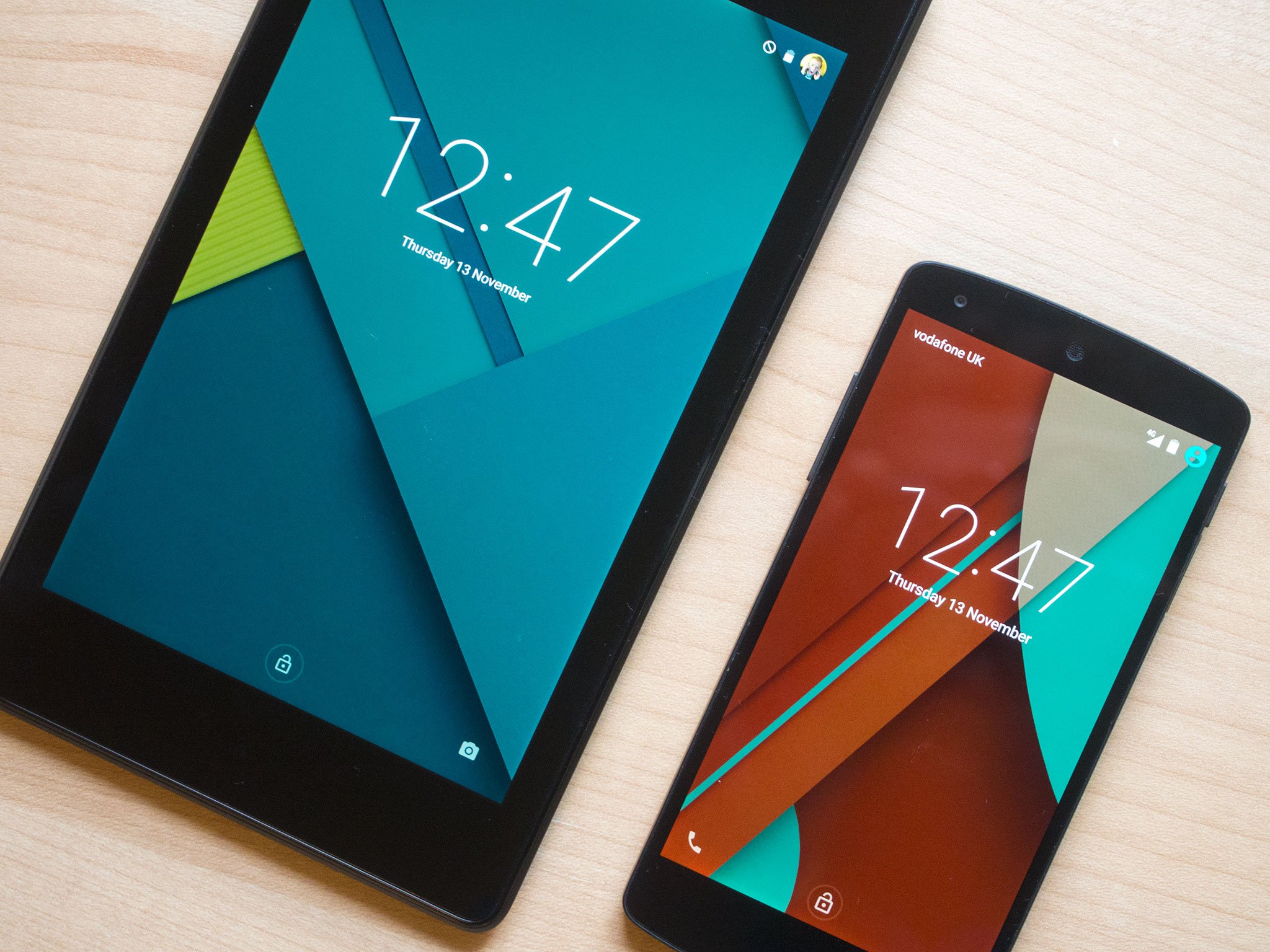
Then we had Material Design in 2014, introduced with Android 5.0 Lollipop and eventually rolled out as the design language of the whole of Google. With Material Design, apps were built out of "digital paper," with slick transitions between app elements. And it gave us common UI building blocks we know in Android today, like the floating action button and pull-out "hamburger" menus for app navigation.
Material has evolved over the years, eventually being a lot less colorful and more practical than the original 2014 demo reel. Many early Material apps felt like "cookie-cutter" designs, and it took a couple of years for Google to debut full Material Theme guidelines to help developers tie their own design language and brand identities into Material Design.
If the latest leaks around Android 12 are to be believed, the next step in the evolution of Material Design is the appropriately named "Material NEXT." Much of the public information on Material NEXT comes from the Android 12 Developer Previews and leaked mock-up images unearthed by xda-developers.
Android 12 sets the tone for the next generation of Google products.
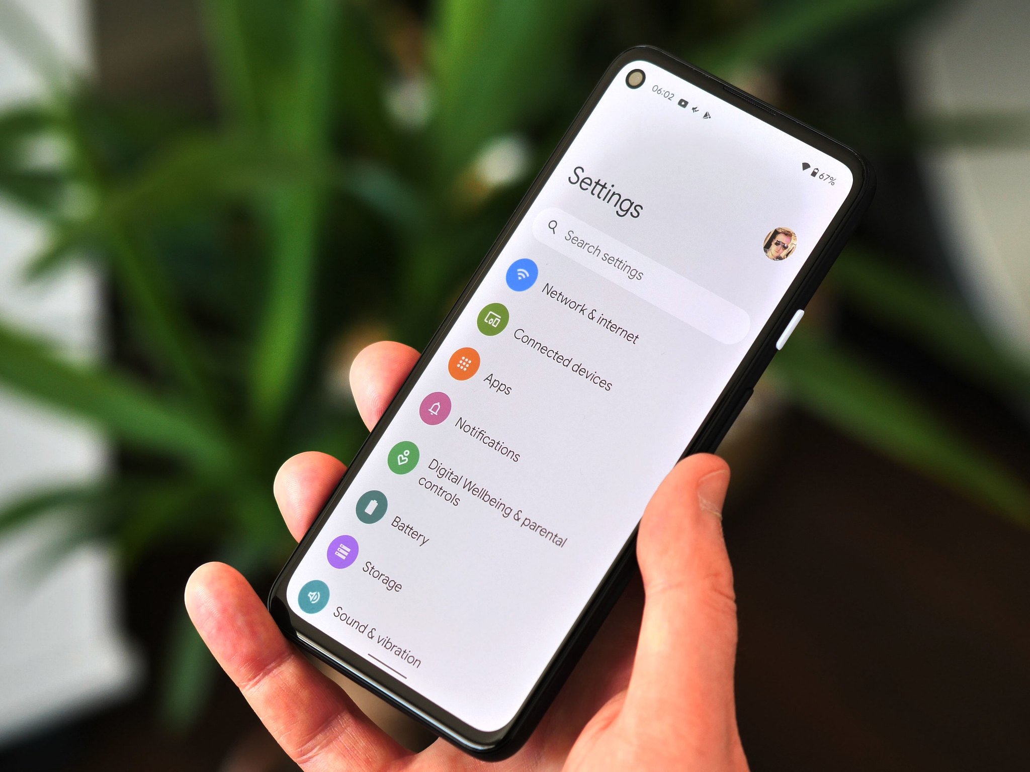
We don't yet have a complete picture of the third iteration of Material Design. Nevertheless, from what we can see right now — on phones at the very least — it'll be more big-screen friendly, with larger borders, thicker lines, and a generally "chunkier" look to it. Case in point: The new bolder lines for lock screen patterns and the "fat finger" volume slider. Even the text of the "At a Glance" widget has been made heavier in the most recent developer preview. It's an apparent concession to the clarity of information over pure information density. It also sees Android moving past the finer typefaces once used to highlight new, high-resolution displays used in the best Android phones of years past.
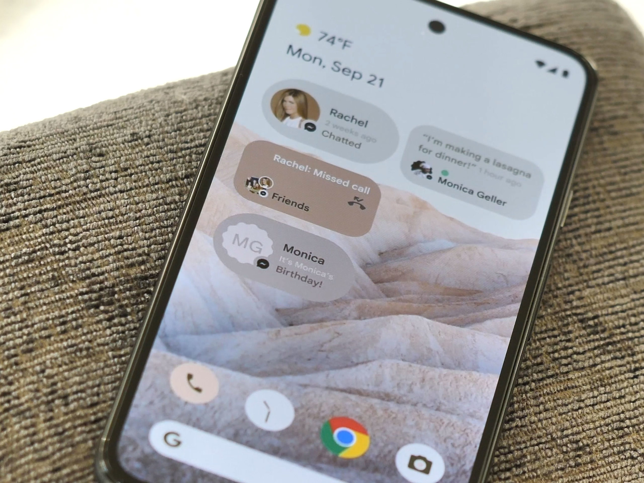
Android 12 also looks set to debut "Monet," a feature capable of automatically pulling colors from your chosen wallpaper and matching them to the Material palette to theme the entire system UI. That's what we've seen in leaked images of the upcoming People Hub widget, which assembles conversations and other interactions into a grid on the Android 12 home screen.
All of this might seem like a significant departure from the original "digital paper" concept that birthed Material Design. But Material was never supposed to be limited just to phones. It's meant to fit onto basically any screen displaying a Google product or platform. The way we interact with those screens has changed considerably since Material's debut in 2014, and so the design language of the software on those screens, of course, has not stood still.
Android 12 could, perhaps as early as next month's first public beta, give us our first proper look at Material NEXT, setting the tone for the design language of Android (and Google more broadly) over the next few years. That generational step forward in terms of design could turn out to be one of the most significant new additions in the next version of Android.
Other odds and ends on a working Sunday:
-
The Samsung Galaxy Upcycling program is pretty neat and certainly more useful than having old phones sitting unused in a drawer. (A crime of which basically everyone at AC is guilty many, many times over.)
-
The ASUS Zenfone 8 series is coming, with heavy hints being dropped that a compact phone packing flagship specs is on the way. Good news for fans of smaller handsets, who have relatively few Android options at the high-end.
-
Material NEXT aside, the recent launch of the final Android 12 developer preview means we're just a month away from the first public beta, the point at which Google usually deems a pre-release version of Android basically good enough to be used as your daily driver. This being a big year for Android, I have no doubt I'll be back on the Pixel 5 running Android 12 before long.
-
Having spent more time with the Galaxy S21 Ultra recently (having also used the OnePlus 9 Pro and Oppo Find X3 Pro), I'm more sure than ever that super telephoto cameras are the most exciting thing to happen in mobile photography in the past couple of years. Outside of Huawei, which of course faces a unique set of challenges, I don't see anyone matching the S21 Ultra's 10X zoom this year.
That's it from me for a few weeks. Stay safe.
—Alex


0 Commentaires